Photo composites are a great way to express your creativity and vision as an artist. You can craft images that otherwise cannot be accomplished. Many people shoot landscapes or architecture, which make fantastic backgrounds of a scene. But not everyone has access to models and fine garb. Therefore, using free stock images of models is a viable alternative. A good resource is e.g. https://www.deviantart.com. Whenever using free stock images, you should mention the source and carefully read the terms of use. Also seek premission to use other people’s photographs if they don’t have a terms of service.
Since the model has typically been shot in a different environment than you used to photograph your background, one of the occurring problems is to match the color and light, which is essential to make the final composite believable. For more on my photo composites, also read my recent article that I wrote for Alien Skin Software:Exposure for Photo Composites
In the following, we will place a model into a landscape scenery. The model is supposed to walk across the field. The landscape is a typical view of German country side, where I live. For the model, we use this free stock image. by Faestock.
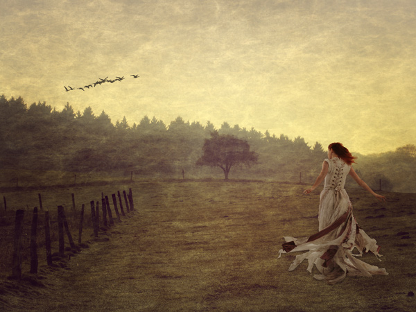
The final photo composite
The first step is to cut out the model from the original photo and to place her into the new background. Obviously, the dress is far to bright and the colors do not match with the new scene.
Original photo of the model, placed into the new background
In the next step we considerably darken the model using curves. This way we can darken the highlights more than the shadows. Best to use a Curves adjustment layer, so you can still modify it afterwards. Since we make several changes, the option to finetune the Curves in a non-destructive manner is very useful.
For the landscape, I applied a texture to give a painterly feeling. In detail it is the texture Rice Paper from OnOneSoftware Perfect Effects. (You can also find free textures online by doing a search)
I kept some of its color to obtain a stained look. To match the texture, we also apply the same texture overlay to the model. Textures are often applied in a contrast blend mode, e.g. soft light. Here a stronger effect is achieved using the vivid light blend mode at reduced opacity. Furthermore the saturation is slightly reduced.
Apply texture to the model
After the texture has been applied, the skin takes on too much yellow of the texture and the hair is still too red. One technique that I use all the time for color matching is to use the Average filter in Photoshop. This will produce a representative color for the background image.
Use the Average Filter to obtain a representative color of the background
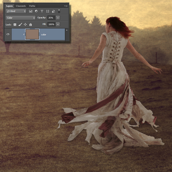
Create a new layer filled with this color, set to the Color blend mode at a low opacity, allows a good matching. Since we only want to apply the color layer to the model, we use a clipping mask. To create the clipping mask, position the color layer above the woman layer. Hold down the alt/Option key and move your cursor between the 2 layers, you will see an arrow appear. Click to apply.

In the last step we want to account for the light that shines from the sky on the hair, and we also want pick up some of the light that is reflected from the ground onto the model and the dress.
To account for the variation of color and light of the background, duplicate the background layer.
Move it above the woman layer.
Choose Filter>Blur>Gausian Blur to blur the background layer until details vanish and we obtain a smooth variation of the color.
Blur the background
Next we project its colors on the model, by choosing the Soft light blend mode, at reduced opacity. Again, we use a clipping mask, to limit the effect onto the model. The hair gets a beautiful rim light and the skin as well as the dress take on the color of the surrounding. This completes the color and light matching.
[mc4wp_form id=”4721″]

If you really enjoyed this, you may want to step up your your skills with our premium video tutorials on Download or DVD. This support is also how we keep the lights on here at the CAFE and enables me to write free content.
Happy photoshopping and leave a comment !
Get in-the-know!
Join our list to receive more tutorials and tips on Photoshop. Get exclusive tutorials, discounts and the free super guides. No spam, all content, no more than once a week.
If you’re on our list, you will receive it free by email as soon as it’s available. If not, sign up now and get the CS6 Superguide for free. Or click the image below.
This site uses Akismet to reduce spam. Learn how your comment data is processed.
In this tutorial, we will use the powerful tools of Photoshop to create a realistic modern smartphone that you can...
7 tips in Lightroom. Tips to help you work faster and better in Adobe Lightroom. How many of these do...
NEW features in Lightroom Classic 9.3 June 2020 HUGE update! Learn how to use all the new Lightroom Classic features....

No images displaying here but looks really interesting
Its fixed now, you should see the images. Migrating to a new website
Thanks Colin – wonderful tutorial – I have been using texture overlays for awhile but was always a little frustrated with the colour matching. This will definitely help my workflow.
@frankbramkamp:disqus did a really nice job with this tutorial.
Thanks Colin – wonderful tutorial – I have been using texture overlays for awhile but was always a little frustrated with the colour matching. This will definitely help my workflow.
Looks amazing, but the instructions were not specific at all… I got so lost after the texture thingy…
To be honest, this doesn’t look convincing at all. It has that stereotypical “overly-processed bad photoshop” look to it. At the very least you could have done without the overused faux-canvas texture.
Not supposed to be “convincing” By that I’ll assume you mean “realistic”? It’s stylized as the artist (Frank) intended it to be, this is actually a very popular genre with younger artists. We all have different tastes and we shouldn’t let our personal preferences cause us to be prejudiced.
Love this tutorial, come back again and again as I just can’t memorize the steps. Thank you!!!
You are a genius! Averaged the color of a dogs furry face, and all the shots matched no matter what color background he was shot on. Where have you been my last 25 years???
Thanks for the tutorial. I just completed a composite for an album insert. This tutorial made the composite consistent throughout and the band loved it. Once again, thank you.
Thanks for this. Clear and easy to follow.