This Photoshop tutorial shows you how to replace a boring blue sky with a dramatic cloudy sky.
In this Photoshop Tutorial, I’ll quickly show you how to replace this sky without making any selections.
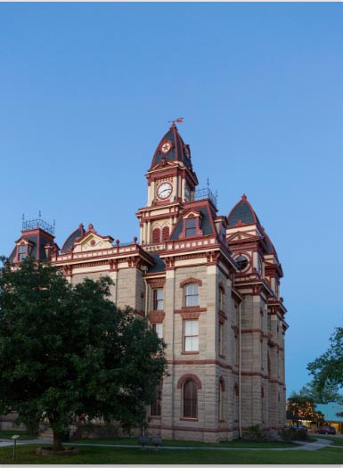
We will begin with a photograph that I captured just outside of Austin Texas. It’s a really interesting building (Fun fact: it was featured on the TV show, The Leftovers). The problem is that the sky was plain blue, which isn’t so bad if you use a polarizing filter to make it more blue, which I did. However, because I don’t live in Texas (I’m in California), I’m unable to go back when the sky is different to get a more moody photo. This is a common issue for people who travel and have limited time to capture photographs and have to take the best they can get, given the opportunity.
Next I need a photograph of clouds. I keep a collection in Lightroom of all the clouds and skies that I shoot. Whenever I see an interesting sky, I shoot it with the best camera that I have with me. Sometimes it’s a DSLR and sometimes its a phone (Don’t scoff, I have an iPhone XS and a Google Pixel 3 and they are really quite impressive)
If you don’t have the right sky, you can always grab one from stock.
A great source for stock photos
► Become an Adobe Stock Contributor:
► 10 free images from Adobe Stock
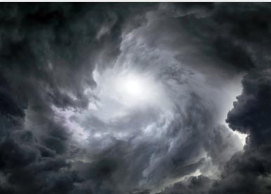
Here is one that I got from Adobe Stock, that looks really nice and eerie, maybe make a good haunted house out of it.
Ok, on with the tutorial..
Drag the sky into the house photo, it will become a new layer.
Choose Cmd/Ctrl+T for free transform.
Drag the corner handle to resize and reposition the sky. (Pre Photoshop CC 2019 – Hold down the Shift Key to constrain proportions).
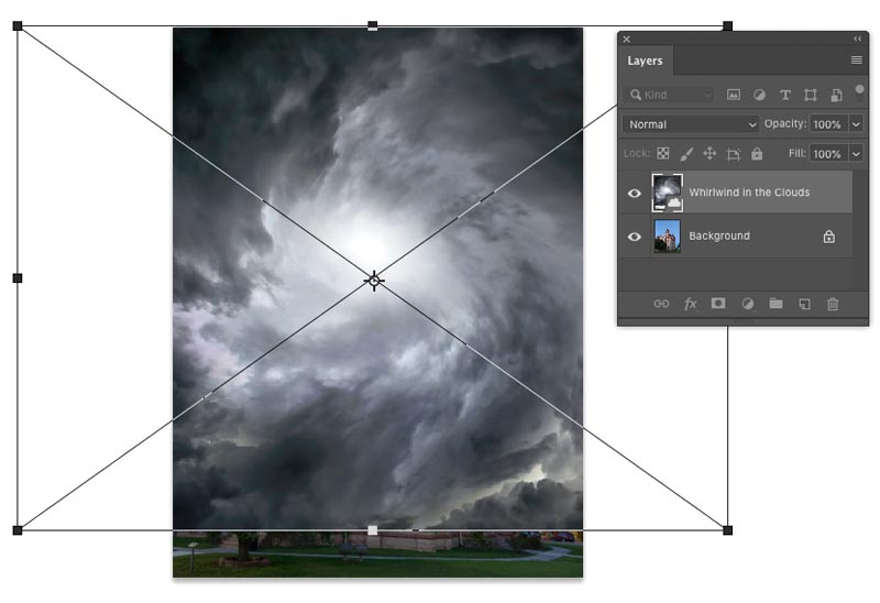
This is usually where you grab the masking tool. We won’t need to do that in this tutorial because we have a blue sky.
With the top layer selected, choose Blending Options from the FX in the Layers panel
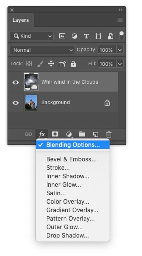
You will see the layer style box. Go to Blend If and change the dropdown from gray to blue
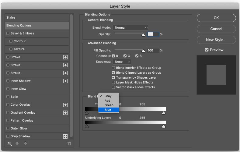
If you want to select use a color on the top layer, use the top slider, we want to choose the blue from the layer beneath, so we will use the bottom slider
As you slide the slider, you will see that the blue sky will be replaced by our clouds, move it as far as you can before the clouds start to disappear.
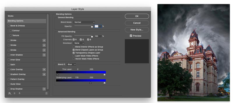
Now we need to finesse the selection, hold down Alt/Option and drag on the left of the triangle, you will see that it now splits and enables use to refine our blending.
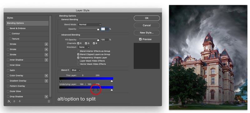
You might have noticed the selection isn’t quite perfect, we may have lost a little of the house, let’s fix that.
Press Cmd/Ctrl+J to duplicate the house layer and drag it to the top
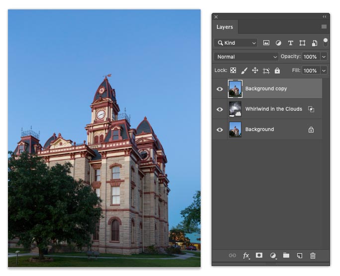
Let’s create an inverted mask, one that hides the layer
Hold down Alt/Option as you click on the new layer mask icon

This creates a mask that is black and hides the layer
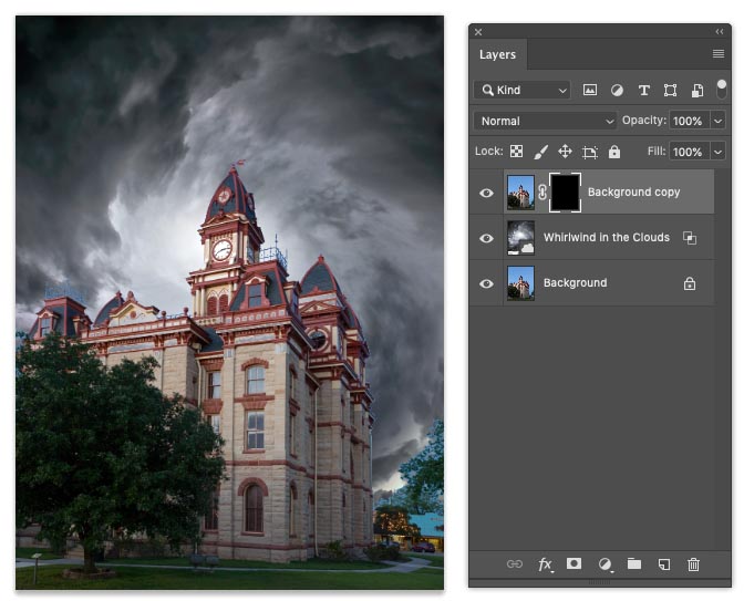
If we paint with white, we can bring back parts of the layer.
Choose white as the foreground color and choose a brush (b)
![]()
Paint on the house where it was blending out, so that all the house is showing again. I mainly found it fading out on the windows.
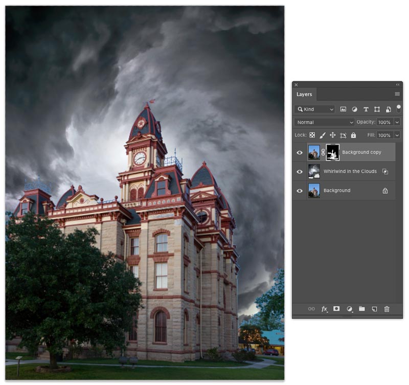
Notice that there are some areas of blue around the tree to the right and a couple of other spots, let’s fix it.
Create a new layer on top and change the blending mode to color.
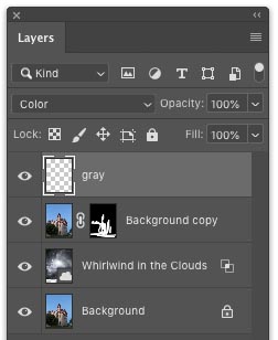
Paint over the problem areas and notice that the color makes the issues blend right away (For larger areas, you can use Content AwareFill)
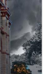
Looking much better now.
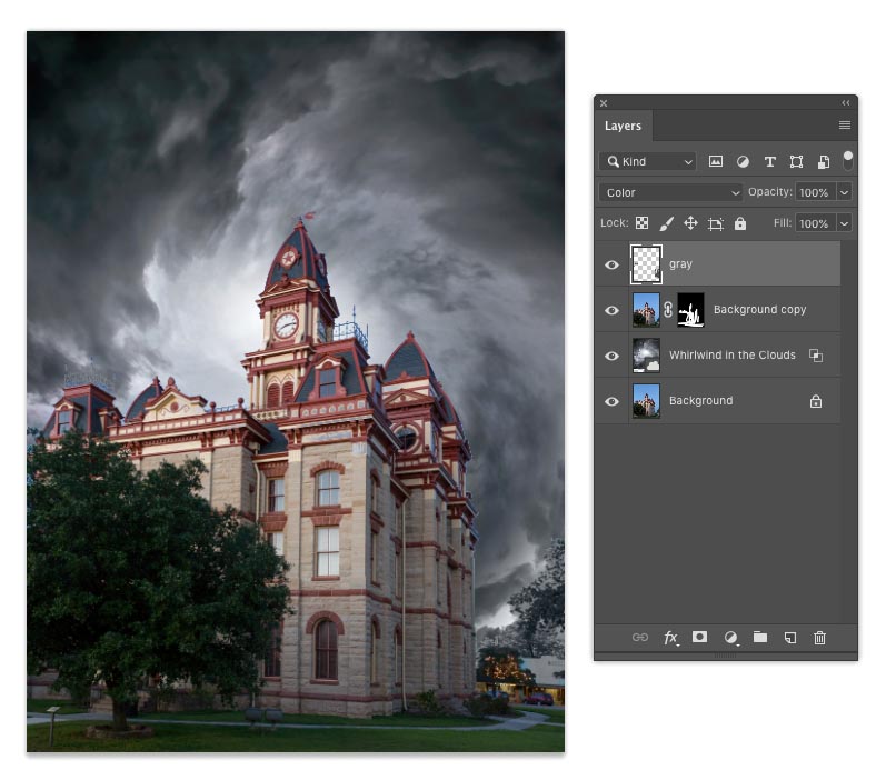
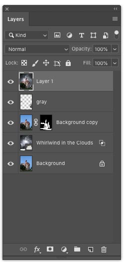
The first thing you need to do is get everything on a single layer, we don’t like to flatten, because that limits options later.
Select all the layers (Click and Cmd/Ctrl click on the layers) and Press Cmd+Option+Shift+E (Ctrl+Alt+Shift+E) This creates a Stamp Visible layer, or composite layer.
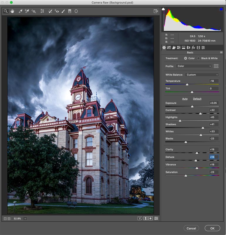
Choose Filter>Edit in Camera Raw
You can see the adjustments I make here in the screen shot.
And now we have something that looks a bit more like something out of the Adam’s Family.
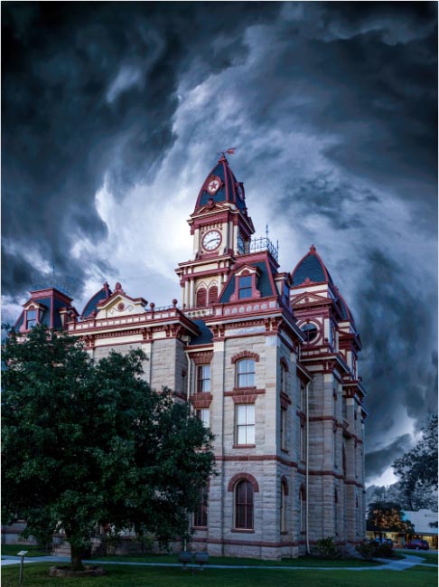
Thanks for checking it out! I hope you enjoyed this tutorial as much as I did creating it. (I really do enjoy this 🙂
Great to see you here at the CAFE
Colin
PS, drop a comment and say hi!
Don’t forget to join our mailing list and get notified whenever I post a new tutorial, as well as some extra goodies that only our subscribers get 🙂
This site uses Akismet to reduce spam. Learn how your comment data is processed.
It's a bird, it's a plane, no it's block letter Extrude in Photoshop. This was a request from the forum:...
In this Photoshop Tutorial, Colin shows you how to combine type and photos in Photoshop. Learn how to place a...
Hope you enjoy this tutorial, specialy written for photoshopcafe.com by raul bermudez ,elemento.1 Step 1 First start by creating a...
After you are finished, do you leave the Stamp layer?
I always leave everything in case I have to re-edit the image
In the beginning of the video, you pasted the swirling cloud background in and enlarged it to cover the whole sky. You didn’t cover the whole sky and told us not to worry, that we would get to that later. If you did cover the bottom of the image with the clouds, it would take care of all the extra blending and color adjustments for that tiny corner area. I do learn things from you, Colin, but sometimes you make me wonder as well.
I’m human and make mistakes, but it didn’t stop people learning from the tutorial. My goal was to teach, not create a portfolio piece.
Great Tutorial… much easier than a lot I have seen
👏👏👏👏🏆🏆🏆
I like this tutorial