The most important thing you can have to brand your YouTube channel is your channel art. This is where you personalize your channel and add your own personality and style. The colors and style that you pick is entirely up to you.
(Click to subscribe to our youtube channel for more tutorials). 
Just a little side note: I decided I wouldn’t do any training or tips on building a YouTube channel until I reached at least 100,000 subscribers My YouTube Channel here (PhotoshopCAFE) . I don’t want to be teaching anything until I have proved that what I’m teaching works. Thanks to all of you, I passed 100k subscribers Jan, 2018. (That doesn’t mean I’m going to be banging you over the head with YouTube stuff, it just means that I feel like I have a few nuggests I can share now).
It’s important that your channel art looks good on all screens that viewers will be watching from: Phones, tablets, computers and TV.
Youtube provides a psd template that is the ideal size with the different regions marked on it. Download the new Youtube template here
This is what the template looks like, open it in Photoshop. Notice the horizontal strip. This is where the important parts of your design should go. I really design for the Text and logo safe area, because this will be visible on all devices. Notice the desktop and tablets are a little wider. The large area is for people watching on TVs through Apple TV, chrome cast, smart TVs etc. Final size is 2560×1440. When you are done, you will save as a jpg and the file size needs to be under 6mb.
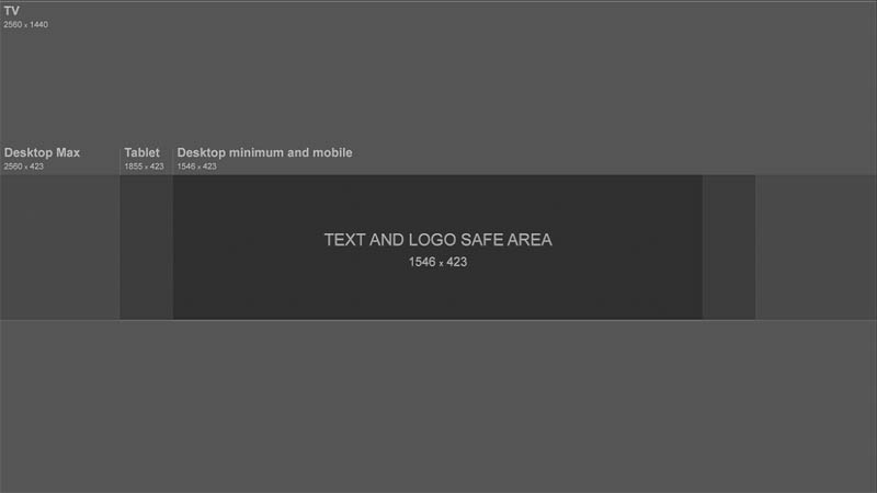
My advice: Design for the minimum but make sure the design works on everything.
The text overlay is in a separate layer group which can be hidden or shown. Watch the video at the top to see how I design with the template in Photoshop.
I love to use Adobe Stock to design my channel art. The reason for this is that you can search and download photos directly from Photoshop. Here is a tutorial on using Adobe Stock in Photoshop.
Another thing I like about Adobe Stock is that you can use any of the photos for free. They will have a watermark on them, but it’s still good enough for you to try out any photo, or combo of photos, illustrations, textures etc. Try different things and when you are happy, you can choose to license the images you want to use and they will be replaced with a high resolution version without the watermark.
To get you started, here is a link for 10 free images.
Become an Adobe Stock Contributor:
10 free images from Adobe Stock
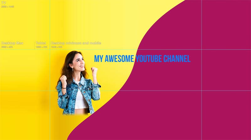
Here is my final design, within the template, notice that I created guides to help me know where the text and logo safe area is.
Once you have designed your art, it’s time to upload to Youtube. I’m going to show you how in both, the old YouTube layout and the new layout (2018).
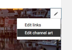
In the older layout: click the pencil in the top right of the header and choose Edit channel art. (Make sure you are logged into your channel)

In the new YouTube layout click the camera icon in the top Right.
You will now see the uploader.
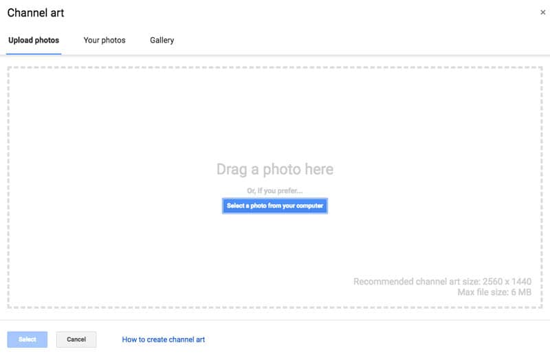
Either drag your Channel Art (saved as jpg File>Export>Save for Web) or Click on the blue button: Select a photo from your computer
Choose your saved channel art
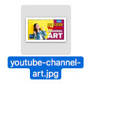
Click on Se;ect
And you are all done.
I hope you found this tutorial useful. Check out all the other free photoshop tutorials here at PhotoshopCAFE that will help you design amazing channel art, thumbnails as well as lots of other things.
Don’t forget to subscribe to our newsletter for cool freebees
Drop a comment and let me know your thoughts and questions
See you at the CAFE
Colin
This site uses Akismet to reduce spam. Learn how your comment data is processed.
Use Range Masks in Lightroom and Camera Raw to selectively adjust your photos. Luminosity masks and color range masks automatically,...
How to Color Grade Video in Photoshop Camera Raw ...
Learn how to make 4 vintage photo effects in thisPhotoshop tutorial. Learn processing techniques that were historically used and...
Thanks a lot – clear steps, well explained!
Great tutorial, thanks
love you
Wow amazing. Easy tips to understand and follow. It is really proven helpful for me. THANKS
Do you by chance have a template for making the circular channel icon? Having a hard time getting it properly centered and making borders etc.
You can download templates on youtube
Hello, I’m quite good at photo shop elements. I created a banner that is 2120×576 pixels. This was just a test image to make sure that my important info appeared in the safe area (It’s less than 423 pixels high. When I add it to my page it’s at least 2 times too big. Way outside the safe area. Any ideas what’s wrong? Thanks.